One app.
Every journey.
Case: ScotRail
Goal
The aim was not to promote the app, but to explore how communication could reduce perceived risk and support more confident use.
Introduction
This hypothetical case explores how a campaign designed to support travelers through different stages of adoption could look like — from awareness, to reassurance, to confident everyday use — with each channel serving a specific role in the journey.
Process
Define
To start, I defined the problem ScotRail and its travelers face as ticketing becomes digital. Many travelers hesitate to switch from physical tickets to digital solutions because ticketing feels high-risk. Mistakes are punished, prices feel unclear, and confidence is low.
Research
In Denmark, we have “Rejsekort,” the Danish equivalent of ScotRail’s Smartcard. I analysed their campaign, noting what they did well and where it fell short.
Execution
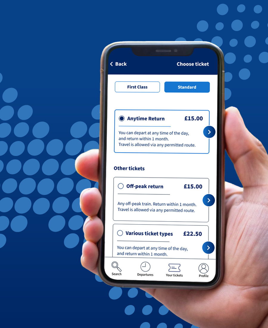
Using the brand design guidelines I created for this case here, I developed a visually coherent campaign across multiple platforms. Through a defined touchpoint strategy, I designed materials tailored to channels and formats relevant to each touchpoint.
Insight
When reviewing the Danish “Rejsekort” campaign, even as a traveller myself, it was impossible to ignore. Its purpose was to push travelers towards using the app instead of the physical card. However, the campaign received significant media backlash due to its extreme measures to force adoption. These measures were also what stood out to me. While they may have been intended as humorous, they instead confused and even worried travelers. The strategy shifted people from hesitation to outright resistance. Furthermore, many travelers use the app today not because the campaign succeeded, but because in Denmark, we never had another choice to begin with.
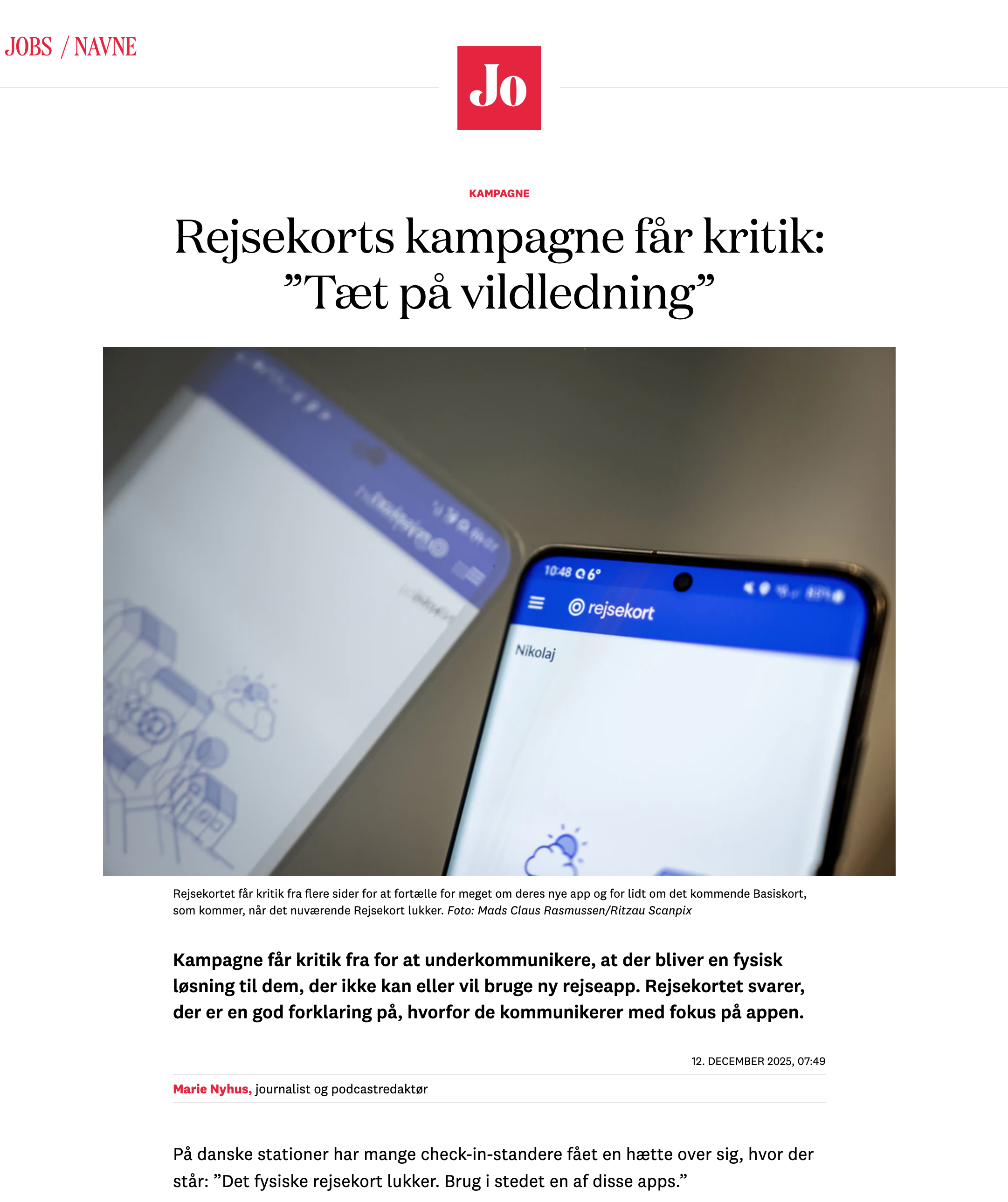
Danish article on the campaign: “Rejsekort’s campaign is criticised: ‘Borderline misleading’”
It highlights how the campaign was too vague about the solutions available to analogue travelers, when the old Rejsekort would be discontinued.
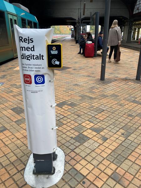
An example of the extreme measures I remember seeing at the time of the campaign.
They covered some of the card readers, in some cases making travelers unable to check in. The monitor on the side says: “New system coming”.
Observations from trip
While in Scotland, I observed travelers when using ScotRail. Most relied on their phones to check in, although I also saw some using physical cards. It wasn’t possible to determine whether the ScotRail app was the primary solution, as multiple digital ticket options exist. This made the campaign in this case even more relevant than I initially expected. If ScotRail wants more travelers to adopt their specific app, then this campaign directly addresses that goal.
Results
The result is a cohesive campaign system designed to increase trust in ScotRail’s app by reducing perceived risk and uncertainty. Across all touch points, the campaign materials respond to the traveler’s current situation — from print and in-station elements to website components, digital ads, and an online guide. This ensures the campaign is both effective and supportive, helping travelers feel informed and confident when switching to the app.