1 brand 2 styles
Case: ScotRail
Goal
The aim was not reinvention, but refinement — strengthening cohesion while demonstrating system-based thinking and contextual adaptability.
Introduction
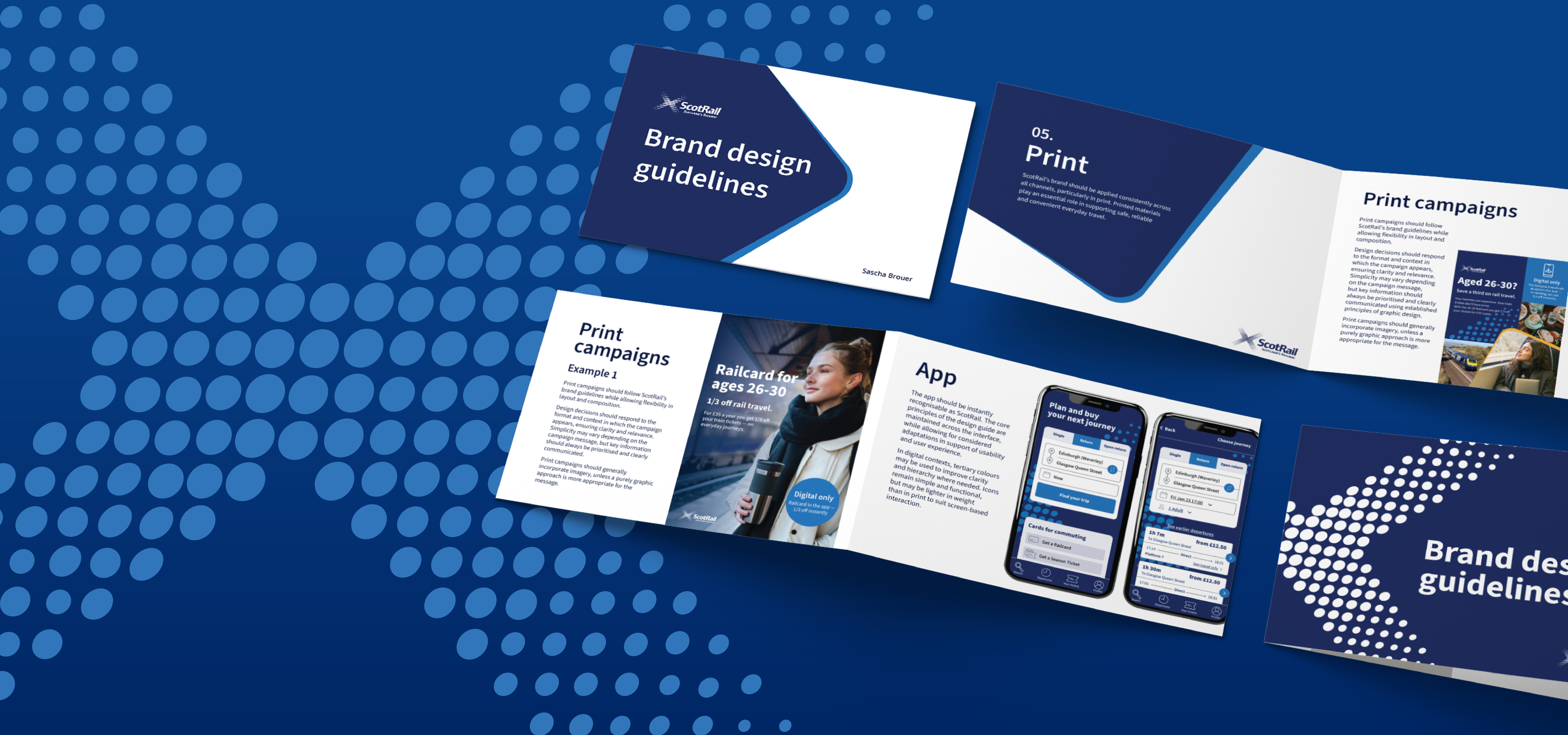
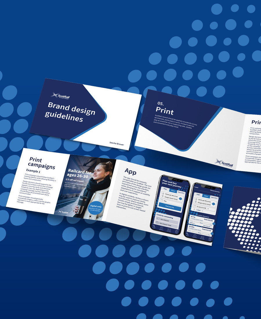
This conceptual case focuses on refining and systemising ScotRail’s existing brand. Rather than reinventing the identity, the aim was to strengthen cohesion and clarity across channels within its public-service context. To explore this, I developed two directions: one that leans into Scottish character, and one that introduces a more Scandinavian sense of structure and simplicity.

Process
Observation
To refine ScotRail’s brand, I first needed to understand how it was currently used. I reviewed all major touchpoints and documented what worked well and where inconsistencies appeared.
Consideration
When reviewing the brand across channels, I also considered why certain design decisions may have been made. Organisational structure, internal culture and contemporary trends likely influenced these choices. I kept this context in mind when making the brand guidelines.
Execution
While developing the brand guidelines, I returned to ScotRail’s channels to reassess decisions and refine my understanding. The iterative process allowed insights to evolve as I moved back and forth between observation, consideration and execution.
Insight
A few key characteristics and patterns became noticeable during my observation of ScotRail’s channels.
Colours
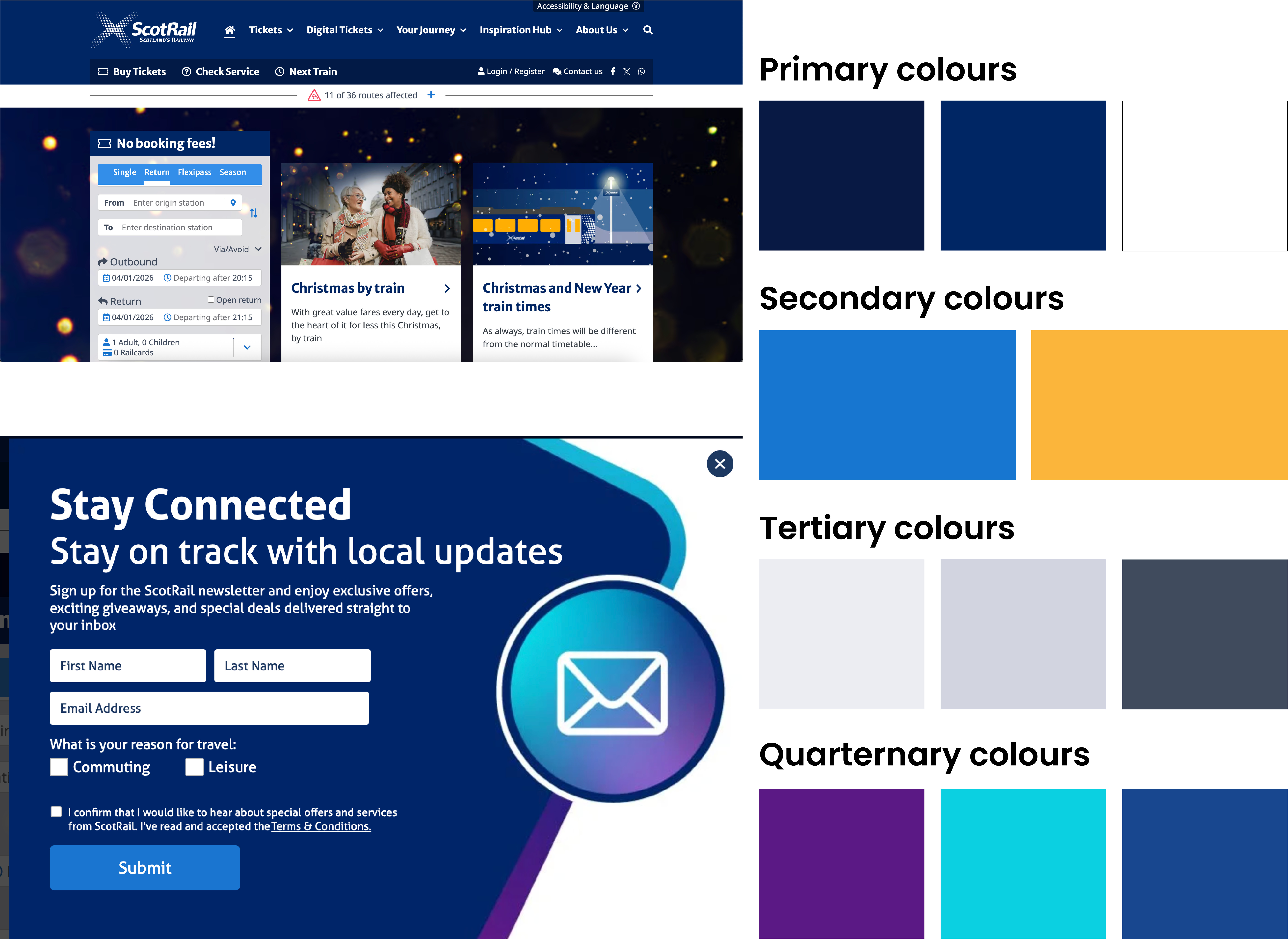
Firstly, there are defined brand colours, however, instead of using these consistently and coherently, ScotRail introduces not only tertiary colours, but quaternary colours.
Typography
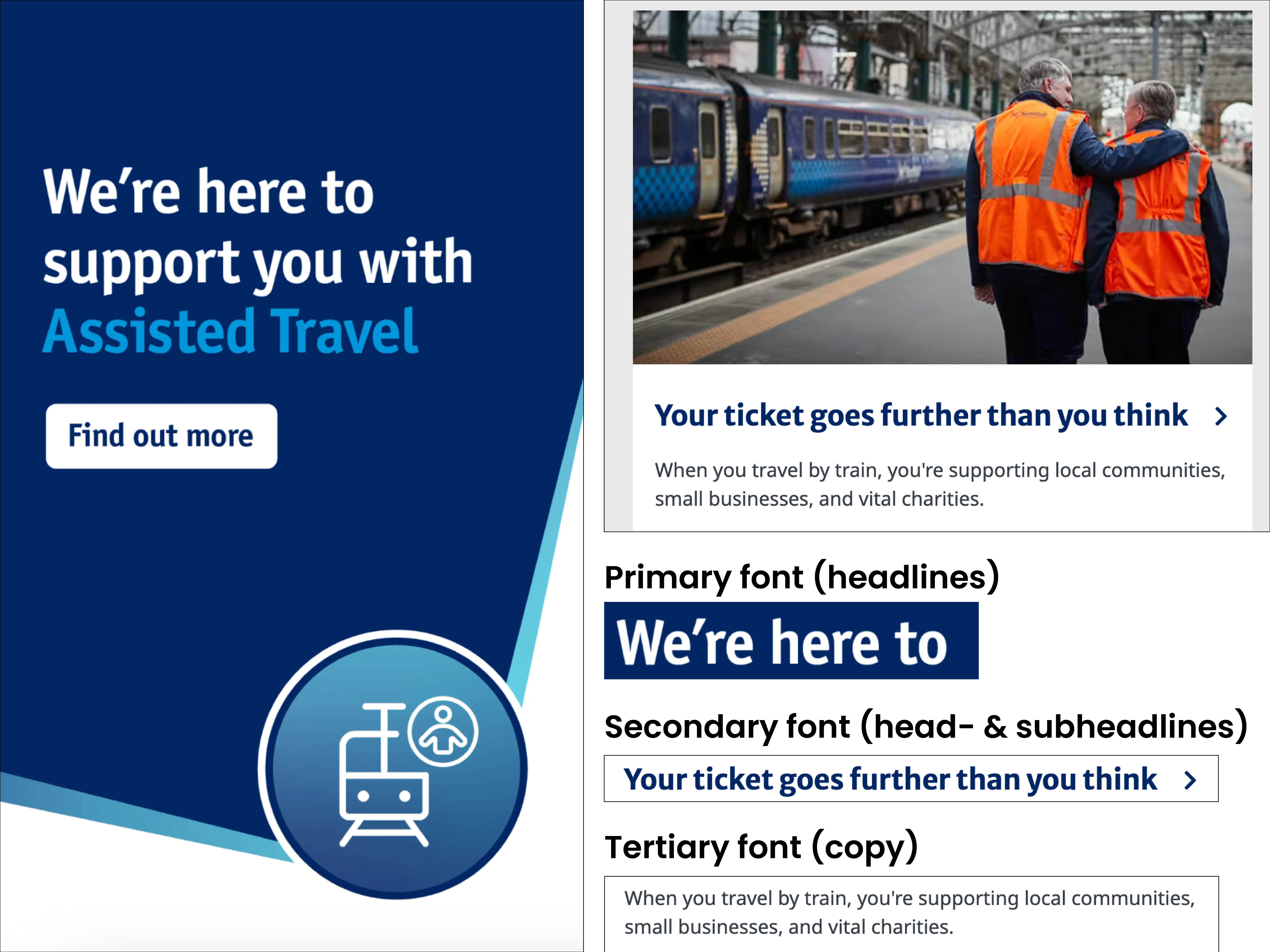
Secondly, during my observation I found three different typefaces. While that might not be excessive, it isn’t necessary as two of the three fonts are virtually interchangeable.
Layout & assets
Additionally, I found that there is consistency in the core assets (see examples below), but a lack of control in composition, colour application, and typographic hierarchy results in a fragmented visual expression.




Overall, I found that despite the well-established brand identity, there were inconsistencies that needed to be tightened for a stronger brand experience.
Constraints
During my observation of the brand, I could only access ScotRail’s digital channels. My plan was to observe how the brand appeared in physical environments during my trip in 2026. With that, I could either reassess the brand design guidelines or add further observations to this case.
Observations from trip
On my trip, I travelled with ScotRail several times. At the stations, I almost forgot it was ScotRail unless I paid close attention. The branding felt more subtle compared to their digital channels. There was less signage and fewer print campaigns than I had expected.
At the same time, my experience as someone visiting Scotland for the first time is likely different from those who grew up there. Despite this, I found that I had matched their tone and style well in both versions of the brand guidelines.
Results
The results are two clearer and more cohesive brand systems that strengthen consistency without altering the core identity – with subtle differences in design styles. Both guides demonstrate my ability to adapt within context, think in systems and maintain brand identity across multiple formats and channels.
Version A
Scottish inspired: More expressive and character-driven, enhancing warmth and visual richness.
See it here
Version B
Scandinavian inspired: Structured and calm, with cleaner layouts and a more consistent visual rhythm.
See it here